
Some of the information is relevant for people who use other platforms (especially Wordpress) but much isn't, because Blogger does so much of this for us.
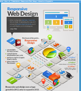
What is Responsive Web Design?

Back in the day, we had ever-increasing screen resolutions, so most people went from 800x600 to 1024x768, etc - the specific varied along with the type of monitor and graphics card. But the constant was the annual joke about "What's your New Year's resolution?" - the answer always got larger each year.
But now there are smartphones, tablets, and giant TV screens in the mix. Users may be looking at websites in anything between 300x200 to 4096 × 2160 - or more if they're using a TV.
To start with, no one was quite sure how websites should cater for this. Many people made two sites: one for their "regular sized" users and one for "mini-screen" users. Sometimes this led to duplicate-content, which didn't amuse Google's search-engines. It made more work (of the boring kind) for people maintaining websites, who had to update two places. And it didn't cater for the super-size-screen folks at all.
After much thought, in June 2012, Google announced that a technique called "responsive web design" was their recommended approach. Basically, it says to have one version of the website, but to put instructions into it (usually with CSS) saying whether or where to show things based on the size of the user's screen - ie, effectively by "responding" to the user's settings.
This article from Blacknight Solutions goes into a lot more detail - and uses more technically precise language to describe the challenges and the approach.
What does Responsive Design mean for Blogger users?
It recommends various books and in the "toolkit" section, it lists options for Wordpress, Drupal and Joomla and JQuery.
Of these, JQuery is used for display tools that a number of Blogger-helpers provide - so I would expect to see "responsive" being added to their features soon.
Apart from the JQuery front, initially I thought that responsive website design didn't matter for people who use Blogger: as Ive explained before, we simply don't have much control over the web-pages that are made to display our blogs. But it made me wonder about how Google might change Blogger so they were following these guidelines fully themselves.
But after thinking some more, I realised that Blogger is already starting to use the responsive design approach with mobile templates: if one is enabled for your blog, then the gadgets that are shown a different on mobile and non-mobile devices ane the way that posts are displayed is different - but the underlying site content (posts and pages) is the same.
And there are things that we can do in our posting and template editing that will help Blogger make our sites work better on devices with different screen sizes.
So, what should we do?
Set the maximum width for pictures.

But what happens if you set the width to, say 400 pixels ("400px"), and a user has a screen which is narrower than this? The question is hard to answer, because mobile devices apply some scaling-down so that in many situations the picture fits, and look fine.
But there are cases where it won't work properly, eg if you want text and pictures to be side by side, and use a table rather than a "<div>" statement to do this. If the amount of space that you allocate to the picture is wider than the space on the screen, then the results my be unpredictable, or the text may be very, very narrow.
I was originally going to suggest working around this problem by specify the width in terms of percentages instead of pixels, for example: style = 'width: 80%;' But, as I found tonight, if you float your pictures to the left or the right, that approach doesn't quite work - the way that the post-editor puts in <div> statements means that scaled down pictures can be left inside empty larger empty divisions, etc..
A better alternative is to continue to use small / medium / large etc, and also to add a CSS rule saying that pictures can take more than a certain proportion (ie percentage) of the available. space. (Thanks to Paul of Spice Up Your Blog who suggested this, as a way to stop pictures from spilling into the sidebar).
Luckily it's very easy to do this - just add a CSS rule in the usual way for your template. The specfic rule to add is
.post img {max-width:98% !important}
When you copy and paste - don't forget the dot (.) at the start of that line.
Also, you may like to experiment with values - you might even go as low as 80% on some blogs. The beauty of this rule is that it specifies the maximum - if your photo is smaller than that, it's not affected.
 Pictures aren't the only things that have a fixed width - the same thing can happen to embeddded documents / PDF files, slideshows, maps, forms, etc. They can be more challenging to use on sites with smaller screen sizes. Somteimes their code might cater for differnt sizes. But one good overall principle is simply to remove the height statement from the, and specify the width in terms of a percentage.
That said, I don't do this for the embedded Google custom maps on one of my sites: as a user I very much prefer to see the map at full size, and to scroll around as I need to - so I've assumed that my visitors prefer the same approach. It all depends on the nature of your site, and how people use it.
But many Bloggers use AdSense by getting the code and installing it to their template or putting it into an HTML/Javascript gadget, perhaps because they want better control over the ad colour-scheme, or to have the option of image-only AdSense ads.
Fortunately it's pretty easy to adapt these ads to be responsive - this excellent article from Digital Inspiration explains this technique in more detail.
 My instinct is that there are other things which blogger users will need to think about as we move into a "responsive" world - at least Bloggers who care about visitors from different screen sizes will need to be busy.
At a minimum, consider whether you need to enable a mobile template for your blog, and set up some specific gadgets just for it.
What else do you think is relevant here?
Giving your blog a special template that only mobile users see
Showing Google maps inside your blog
Getting image-only AdSense ads
Putting 3rd party HTML into your blog
How to add a gadget using Blogger
Adding a CSS rule to your template
Width of other embedded elements, eg PDF files

That said, I don't do this for the embedded Google custom maps on one of my sites: as a user I very much prefer to see the map at full size, and to scroll around as I need to - so I've assumed that my visitors prefer the same approach. It all depends on the nature of your site, and how people use it.
Responsive AdSense ads
If you use Adsense via Blogger's gadgets, then appropriately sized units will be placed on your blog. And (unless you choose the "ads between posts" option in the Blog Posts gadget) - this includes inside mobile-template viewers.But many Bloggers use AdSense by getting the code and installing it to their template or putting it into an HTML/Javascript gadget, perhaps because they want better control over the ad colour-scheme, or to have the option of image-only AdSense ads.
Fortunately it's pretty easy to adapt these ads to be responsive - this excellent article from Digital Inspiration explains this technique in more detail.
Sidenote: I was quite amused with recent announcements by some Blogger-helpers (eg Paul in Spice Up Your Blog) that we can now use AdSense in Dynamic Templates. As far as i know this has been the case since Dynamic Templates were introduced: provided AdSense is enabled in your blog with a gadget (not embedded in posts, or put into HTM/Javascript gadgets), then the Dynamic Template view promised to show an advertisement in an appropriate place (most likely the footer, I think). In princple, this is just another dimension of being "responsive" to different screens and ways of reading website content.
What else
At a minimum, consider whether you need to enable a mobile template for your blog, and set up some specific gadgets just for it.
What else do you think is relevant here?
Related Articles
Who Blogger converts out posts into web-pagesGiving your blog a special template that only mobile users see
Showing Google maps inside your blog
Getting image-only AdSense ads
Putting 3rd party HTML into your blog
How to add a gadget using Blogger
Adding a CSS rule to your template

Responsive wed design is not only good for the SEO of your website, but it is also quite useful for the potential customers viewing your site..You have a amazing site. I didn’t regret to see almost all the written content of your blog
ReplyDeleteActually, I think you'll find that responsive design is all about visitors / potential customers, and nothing to do with SEO.
DeleteComments on this post are now closed: I never imagined it would attract so much spam!
ReplyDelete